Quick visualization of research trends in r
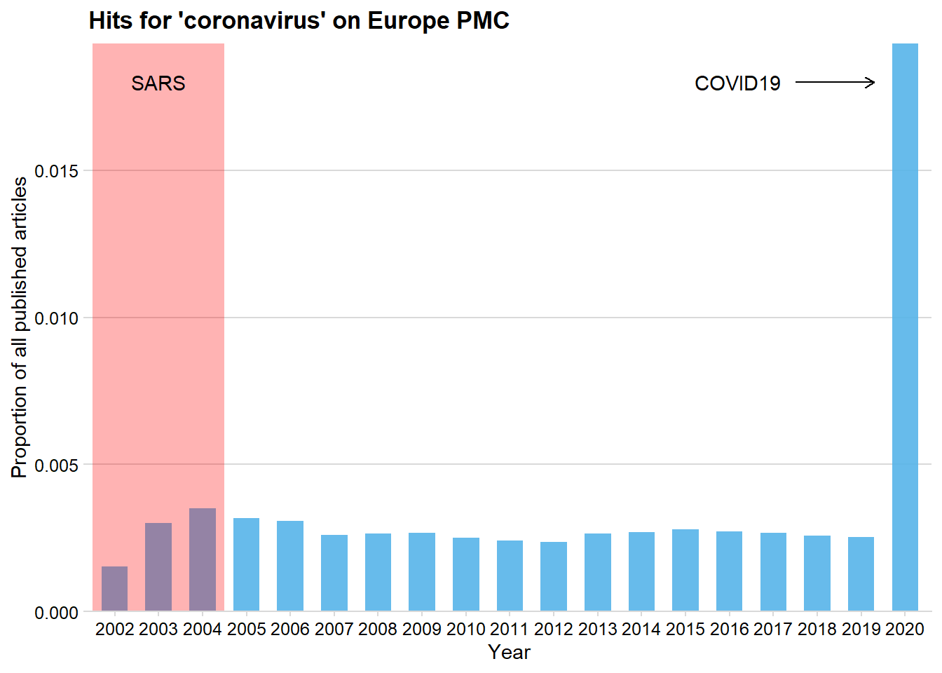
This post is adapted from Daniel Quintana’s blog. It contains a short script to show trends in certain keywords on Europe PMC. As an example I have taken the keyword ‘coronavirus’. First we load some packages:
library("europepmc")
library("cowplot")
library("tidyverse")
Then we query the PMC database with the function epmc_hits_trend(), and plot the results.
#Query europe PMC database (includes pubmed)
corona_trend <- epmc_hits_trend(query = "coronavirus",
                                period = 2002:2020)

#Calculate proportion and make plot.
corona_trend %>%
  mutate(proportion = query_hits/all_hits) %>%
  ggplot(aes(x= factor(year),
             y = proportion))+
    geom_col(fill = "#56B4E9",
             width = 0.6,
             alpha = 0.9)+
    scale_y_continuous(expand = c(0, 0))+
    theme_minimal_hgrid(11)+
    labs(x = "Year",
         y = "Proportion of all published articles",
         title = "Hits for 'coronavirus' on Europe PMC")+
    #extra annotation specific for this keyword
    annotate(geom = "rect", xmin = 0.5, xmax = 3.5, ymin = -Inf, ymax = Inf,
             fill = "red", alpha = 0.3)+
    annotate(geom = "text", x = 2, y = 0.018, label = "SARS",
             hjust = "center")+
    annotate(geom = "text", x = 15.2, y = 0.018, label = "COVID19",
             hjust = "center")+
    annotate(geom = "segment", x = 16.5, y = 0.018, xend = 18.3, yend = 0.018,
             arrow = arrow(length = unit(2, "mm")))
Perhaps unsurprisingly, the COVID19 outbreak has caused a huge increase in articles mentioning coronavirus.